Hey Happy Scrappers! I have a treat for you today!
If you'd like to get fantastic info like this regularly, sign up for the
Dancing Princess Designs Newsletter
If you'd like to get fantastic info like this regularly, sign up for the
Dancing Princess Designs Newsletter
Tips and Tricks from the Trenches
Hi There Scrappers!
Liz (elenasworld) here.
If you are like me, then your scrapping skills exceed your photography skills.
No matter how much my hubby tries to teach me about aperture, shutter speed, and white balance, well, I just want to take some photos. It does irk me that he can take a dozen photos and have 10 great ones, but I compensate for my lack of skills using Photoshop and my scrapping skills.
I would like to share with you a few of my favorite tricks I have learned along the way in my scrapping journey. Photographers might shutter – oops, shudder (lol), but they work for me and free up my time to work on my scrapping. (I will start off by saying that I use PhotoShop, but some of these tips may translate easily into other scrapping programs)
QUICK AND EASY LIGHTENING TRICK
I learned this tip early on from Misty Cato when I was new to digi-scrapping and still trying to figure out how to move layers around and resize my elements without distorting the image (FYI, in Photoshop, just hold down the SHIFT key while you are moving the bounding box – it keeps your proportions)
If you have a photo you love, but is just a little too dark for you, this tip might work.
- Open your photo in a new document
- Duplicate your photo layer
- Change the blending mode of your duplicate photo layer to “SCREEN” (be sure you have your LAYERS window open. The default is set at NORMAL). Your image will probably look too light now;
- Simply adjust the OPACITY slider down (to the left) until you like what you see
- If you image still appears dark after setting the duplicate photo layer to SCREEN, duplicate the layer again and adjust the opacity as needed
At most, I will duplicate my photo layer twice, set to screen.
If this doesn't work for you, just play around with the other blending modes
One thing to note, when your image or element is too dark for your needs, you can also go to
IMAGE > ADJUST > HUE SATURATION (you will see Hue, Saturation, and Lightness)
If you adjust the lightness this way, you will tend to lose image quality and everything will look washed out, like a favorite t-shirt laundered hundreds of times.
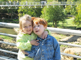
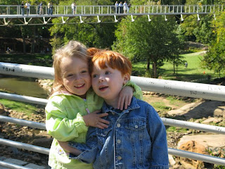 I love this photo, but there are lots of shadows and their faces seem too dark. The image below is how the image looks, utilizing the quick and easy trick of using SCREEN to lighten the photo.
 MY FAVORITE PHOTO TINTING TECHNIQUE
One of my favorite photo adjustment techniques is to apply a soft brown tint
I use this on at least half of my photos when scrapping.
- Open your photo in a new document
- Duplicate your photo layer
- Set your foreground color to a medium brown color (I always use the eyedropper tool and click on my daughter's hair to get the brown I like)
- Make sure your duplicate photo layer is active /the layer you are working on
- Go to IMAGE > ADJUSTMENTS > HUE / SATURATION, (In addition to the three sliders: Hue, Saturation, and Lightness you will see in the bottom Right Hand Corner a box that says “Colorize”
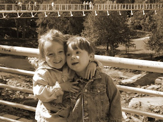
- Click the “Colorize” box (this will change your duplicate photo layer to a brown image)
Here is my colorized photo
 Now, here is where the real fun starts
Your colorized photo layer will be on top of your original photo layer
Change the blending mode to “Soft Light”
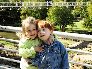 The key is to have fun: play around with the blending modes, the opacity levels
Don't be afraid to try things out (remember you can always undo)
You might be surprised and have a happy accident that you love and will want to repeat again and again
(I actually stumbled on this technique when I was trying to get a sepia effect. I had too much brown, and was trying to tone it down. What I found was a great, easy way to bring out some awesome highlights in my photo without having to do too much).
SIMPLE TEXTURING
Sometimes you have a great photo, but maybe it is not quite as sharp as you would like, or maybe there is a little bit of jitter – this happens to me a lot! I can't always tell that I am not in focus, until I look at my photos on my computer screen. Using blending modes and some of your digi-papers can give you some great results!
Here are some fun things you can try out.
Example One
Original photo
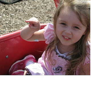 photo layered above Butterfly Heaven paper
photo layer changed to multiply
Texturized photo
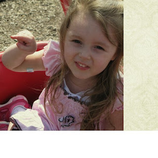 Example Two
background paper layered above photo layer
background changed to color burn
you get a different feel, depending on the background paper you chose
paper from Butterfly Heaven
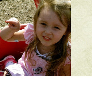 paper from Comfort and Joy
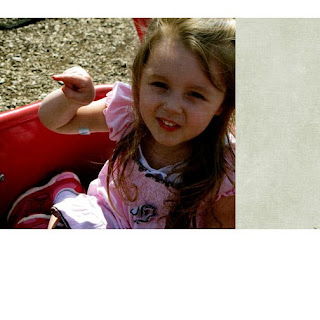 Example Three
background paper layered above photo layer
background layer changed to soft light
paper from Dance in the Rain
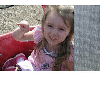 Example Four
background paper layered above photo layer
background paper changed to overlay
paper from Face the Sun
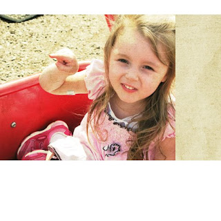 These are just a few ideas of ways to add some texture to your photos
You can get different effects by layering the photo above the paper, or having it below the paper
You can adjust the opacity levels or even combine several different adjustment layers
The possibilities are endless
Why not give it a try
Thanks Liz, for the AWESOME Tips & Tricks! Can't wait until next time!


1 comment:
Thank you Liz and Jenn. This is awesome!!!! I just did some really cool things with a photo that I never knew how to do.
Blessings
Laura (emeraldsong-GDS)
Post a Comment